by Azzurra Immediato
_
One of the main recognitions of the link between auteur photography – bad definition, I know – and the covers of records, in Italy, is undoubtedly the one carried out by Raffaella Perna, in her essay ‘Grandi fotografi a 33 giri’, where the reflection is centred on a sort of epitome that has embraced visions and musical genres. However, to reach the Rock soul of this exploration, one has to step down a few positions – just like in the charts – outlining the contours of what I dared to define PhotoRock, a journey through the Art Covers that defined the imagery of this music genre in the world.
As already clarified by Perna, the role entrusted to the cover image of a record, from the second half of the 20th century, coincided with a wider recoding of the aesthetic, of media and commercial language of the musical universe, understood as a melting pot for transmedia, where artistic and aesthetic intents would dialogue, relate and create a completely new grammar. The majors had well understood this potential and, for example, the Jazz scene was the first to create its own iconic communication, allowing the covers of the albums to be a visual translation of an imago mentis or the complex emergence of the motions of the soul, typical of its sounds and its interpretations.
But Rock had another spirit and if you wanted to define a departure from this imaginary path, you probably would have to start in 1955, when a very young Elvis Presley released his first album and was caught by William V. “Red” Robertson, in a topical and extremely symbolic moment of an exhibition. It is a “screaming” photo, capable of expressing itself for synaesthetic perception: from the image, in fact, one can almost hear the voice of Elvis, the sound of his guitar and sense the movements of his body. So here comes a great innovation: if the covers of classical music albums were similar to those of academic books, if the jazz covers were proposed as introspective portraits, those of rock had to be strong, contain the energy of a concert, the anger of lyrics that desecrated the status quo and bring out the will of rebellion typical of the genre. Yes, because the image of a cover was – and is – identity research and its affirmation; “portrait”, real or figurative, of a band, of a singer, of a different and new message.

It’s 1965 and the British rock band, The Rolling Stones, releases their second studio album of the same name. As in the previous one, the members choose a precise path to follow: remove the group name from the cover and focus the mise en scène exclusively on their appearance, on their faces, real icons of a new faith, the musical one. David Bailey and his lens immortalize the band – in truth the shot is previous, but on the world-wide released albums all information was deliberately eliminated. Bailey’s language clearly outlines, through lights and shadows, the Rolling Stones, presenting them to the world according to a short circuit capable of unhinging the preconception on the nascent rock and roll, framing on the cover five “perfect British boys”, leaving the rest all to be revealed, below that surface. And if Rock was called “the Devil’s Music”, in ’67 the British band recorded the album Their Satanic Majesties Request, for the cover of which they wanted Michael Cooper, an English photographer messenger of the new rock wave of the United Kingdom. The change of register is clear and, perhaps, at that moment, more than music Mick Jagger and his companions were interested in composing a recognizable, albeit transformist, ironic image in what were, after all, psychedelic years.
Here, therefore, Cooper transforms the Stones into what, in the past, would have been a tableau vivant, an allegorical disguise, such as to confuse the real and the imaginary, as it happened in the “artificial paradises” of Baudelaire’s, and fil rouge through the Sixties and Seventies. Through this shot, we begin to understand the intrinsic value of the relationship between photography and graphics. Photography has opened incredible doors until then and the LP covers have taken on the role of icon, a way to offer an immediate “recognition” not only of the face of a singer, musician, rock band, but also of a broader and more distinctive style: the aesthetic sense that pervades this communication, which is halfway between the purity of a musical concert, the artistic inspiration and the rules of marketing and communication: art and marketing meet and everything, for a single moment, brings us back to the Renaissance.
Such convergences are indeed dictated by a plural “seduction”; it takes place on the set, between the photographer and the musician and, then, between the photo and the public. In the middle, in an infinite limbo, there is music. The interpretation and its reading levels take on different roles in a storytelling through images that is spectacularization in the world of rock – and then even more so in pop – and, at the same time, is a portray of a fervent generation: very broad, attentive and ready to embrace a completely different language. The photographer, often a portrait artist, defines the nature of a band, bringing along his paradigms on reality and his personal translation. He permeates the photograph and defines a different recognisability, allowing the observer to look at the subjects with the artist’s eyes.
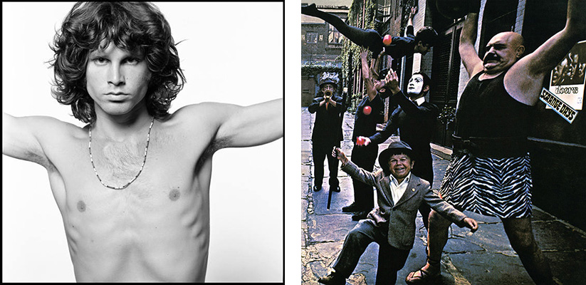
The diffusion of their own point of view, stylistic code of each photographer, becomes part of the construction of a certain rock imagery and creates a new universal memory. Impossible, in this regard, not to mention the famous photo of Jim Morrison, The Young Lion, sprung by the mind of Joel Brodsky and become a masterful icon, surviving even the disappearance of the leader of the Doors. Curiously, however, again in 1967, Brodsky created for the Doors, the cover for the album Strange Days, choosing to show a circus and not the band; this diarchy shows that not only the creative dynamics of a photographer but also the communicative mechanisms of the time, in a continuous swing of experimentations, opposites and visual fascinations.
It is in the Seventies that, after Woodstock, a lot, or rather, everything changes and music rises to the role of leader in a true socio-cultural revolution, at all latitudes. The rebellion expressed by the new generations, against a rigid and academic past, gives way to something unexpected, which, in particular, Art manages to grasp – or had already foreseen. The “surface” becomes the main place for narration, photography and graphics become immediate communication elements, understandable by everyone, capable of reaching everywhere, transversely understandable and, above all, easy to remember. Once again the record companies do not miss the opportunity, just as in music the mixing of artistic languages becomes increasingly frequent, a multitude of expressions able to touch different subjects and styles and to document, in an extraordinary way, what had happened in the world of rock, nonconformist, original and borderline acceptable. In a few years, pop culture would invade the scene, irretrievably.

In this journey in the PhotoRock, it is necessary, however, to refer to two figures of Pop to observe their roots in Rock. In 1972, John Cale released The Academy in Peril, a mainly instrumental album of research and rupture in his musical poetics. For the cover of the album he called Andy Warhol – with whom Cale had already collaborated – and the process of iconization came to life: 25 small color photos, taken in Kodakchrome, bring details of Cale’s face and gaze, creating an exasperated multiple image in which the detail is the phenomenal protagonist, through which the unconventional image of John Cale is built. His face becomes one and multiple, each shot is the result of destructuring to let the imagination flow and open a semantic passage with the captivating title of the disc. Here, is the turning point, both visual and conceptual.
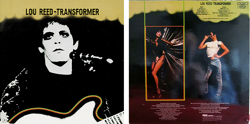
1972 is a special year: Transformer by Lou Reed is released, produced by David Bowie. Reed struggling to recover from the break up with the Velvet Underground – of which he was a member together with John Cale – tries to return to the charts with his second solo album, undoubtedly the one where his artistic identity stands out the most. Part of the credit also goes to the cover image created by Mick Rock: a black and white portrait, graphically rendered in negative and which has become one of the main representations of the New York singer-songwriter. Something else, however, happened on the back of the cover, where the designer Ernst Thormahlen created a double portrait of Lou Reed: the first with the singer as a transvestite, sexy and discreet, the second, very masculine, with Reed in white T-shirt, motorcycle hat and tight jeans to show an erection allegorically created with a banana in his pants. Of course, in Italy, it was subject to censorship, with the introduction of a golden band on the groin bearing the words “Produced by David Bowie and Mick Ronson”. Furthermore, Lou Reed was also shot by the Italian Oliviero Toscani in 1974, maintaining, however, that aspect already consolidated and well known.
In the second half of the 70s, rock underwent the charm of the Punk current and, in England, with the Rolling Stones at the peak of their fame, other bands appeared on the scene, tentatively “independent” – as we could define them today – but which, alongside their musical contribution, concurred to convey a new cultural identity, determining a style that soon made its way also in fashion or in the visual arts, both in Europe and overseas. The privileged eye of this moment was, of course, that of Roberta Bayley, a Californian photographer, who lived in London and New York, deeply involved in the Anglo-American punk rock scene. Her lens made icons of Iggy Pop, Blondie, the Sex Pistols, the Ramones, for the cover of their self-titled and debut album in 1976 or, in the following year, the cover of LP Blank Generation by Richard Hell and Voidoids. The latter proposes a representation consistent with the message of the artists portrayed, present, arrogant and with a brazen attitude towards the whole world: “Here we are, it is us, this is our music, and we are against everyone you, we are other than you“, they seem to scream.

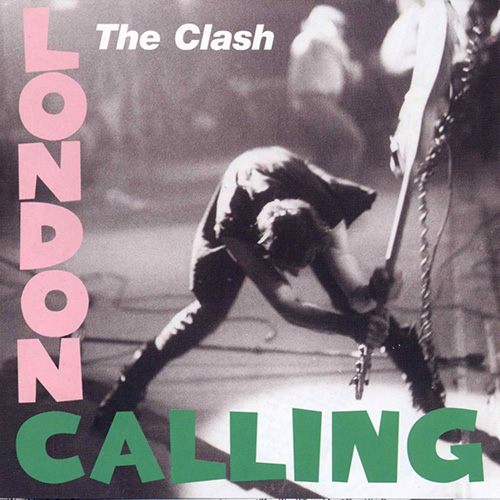
Halfway through this journey, it is necessary to take a breather and, remaining in the punk rock scene, start thinking about the route, especially the one already travelled, in a simple yet surprising way: it is 1979, the Clash publish the album London Calling and the cover image is a photograph by Pennie Smith, considered the rock photo of all time. It is a shot taken during a concert on September 21, 1979, in New York and, towards the end of the show, the bassist of the English band, Paul Simonon, violently threw his beloved Fender Precision Bass on the stage. Smith crystallizes that unexpected and inexplicable instant – which, in 2011, Simonon himself explained in an interview: the safety rules of Palladium did not allow the audience to get wild and reach the stage, as they would normally do; his frustration with the ban got the better of him, prompting him to destroy his instrument in a moment of anger.
The photograph of the lucky Pennie Smith was not supposed to be the cover of the album, since the author regretted the – obvious – bad focus; the band, on the other hand, in that fortuitous and well-known shot, glimpsed the true soul of their music and that “destructive” mood that characterizes it. The graphic design deliberately chose green and pink for the album title, as it happened in 1955 for the cover of Elvis Presley. The composition and the final cover of London Calling were intended to be a tribute to the King of Rock & Roll, but also a provocation: if Elvis had become “The King”, revolutionizing the musical universe, the Clash had every intention of proposing their personal revolution through punk. In this process and desire, Pennie Smith’s photography contributed to the success of the band and the album.
The Eighties were a turning point – in which Pop music reaches the top of radio and record charts – becoming a field of visual artistic research of great importance: if, on the one hand, television – and the birth of thematic channels such as MTV – open a door toward videos, more and more singers or bands choose big names of photography to convey their image. The new decade is characterized by a general “superficiality” and the perception of an ideal, utopian beauty becomes a parallel track of those who, on the other hand, try to surprise at all costs. Basically, the eighties cannot be portrayed in a “natural” way since they are the result of a society completely aimed at existential and perceptive artifice. Many examples of this change can be seen in the pop scene, where we find photographers from all backgrounds, even fashion: Richard Avedon, Robert Mapplethorpe have signed some of the most aesthetically refined and recognizable covers – in which the dramatization of the body has become an icon, both in grammar and intent.
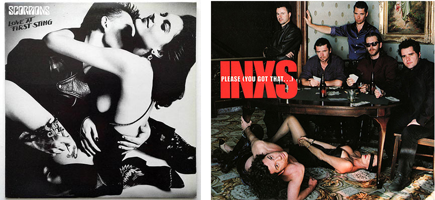
In rock, the names coming from fashion photography were: Annie Leibovitz, Mario Testino, Peter Lindbergh and Helmut Newton to name just the most famous. And between the 80s and 90s, the recognizable stylistic code of Helmut Newton generates the covers of the albums Give by Missing Person (1984), Love at the first sting by The Scorpions (1984) and that of Please (You Got That …) by the INXS in 1993. In each of them we perceive the fil rouge of the photographer’s research, attentive to a precipitous ostentation of the body, glorified in its decay of purpose, as well as in form. Each staging is an extreme vision, functional to the excessive, speculative and compendious narration of the archetypes and clichés about the sexual perversion of society: as Perna states, in her book, Newton “shows how labile and, in the end, illusory, the dividing line between eroticism and pornography can be” and these photos, imbued with his usual language, cross every boundary between his aesthetic and musical research of the LPs.
This period is also marked by the photographic signature of other important names, such as Duane Michals and Anton Corbijn who have returned a semblance of the most intimate rock world, linked to the concept of introspective “portrait”, connecting the cover photo of an album with the message it contains. Anton Corbijn, for example, plays the role of photographer but also of video clip director for the most famous bands of those years, while portraying these subjects for the most prestigious international magazines. Long was his relationship with U2 for which he edited the covers of The Unforgettable Fire of 1984 and All I Want Is You, in 1989, evocative stories of a cinematographic matrix, in which, the perspective is immersive or the focus is on Bono Vox. Equally memorable remain the cover of Seven Seas by Echo & the Bunnymen, (1984) or the one signed for Smashing Pumpkins, in 1998, for Adore, visionary, but in rigorous in black and white, in line with the musical research of the bands.
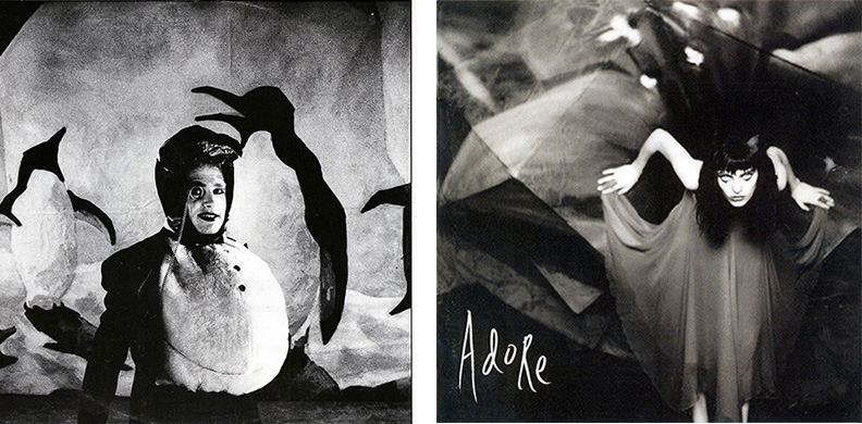
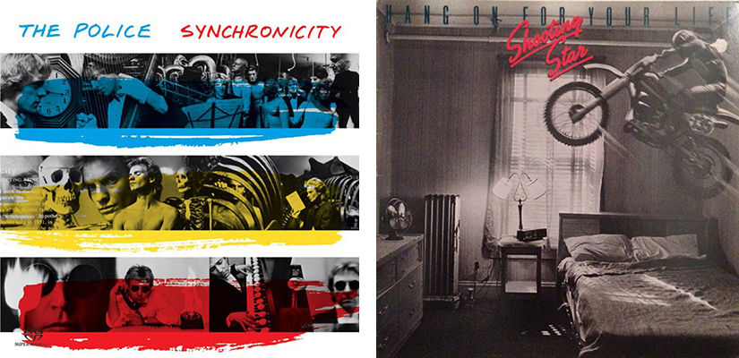
If Corbijn, faithful to his style, masterfully manages to render the soul of his subjects and of the rock bands that he shots, Duane Michals, on the other hand, brings poetic novelty to this visual and commercial communication. Always interested in the most subconscious, surreal or extremely realistic aspect of existence, through photography he goes beyond the limits of his contemporaries, moved, as already seen, by a tight and exasperated dialogue with perfection and ideal beauty. Michals experiments representation and matter, both in the shooting and in post-production, with a pictorial intervention on the images – as it happened at the origins, a century earlier. He works by emotion and, often, according to narrative sequences, dreamlike pluralities, in which it is evident that the crystallized instant is the hic et nunc of a before and after. A fitting example is the cover of Synchronicity by the Police in 1983 or the cover of the Hang on for your life by the Shooting Star, two years earlier.
The link between photographer and band is increasingly defined in a balanced mix between the visual research of the former – and his personal language – and the musical style of the rock bands. Italy responds differently to this “call”: our country activates a process where graphics have enormous communication value and music still binds to certain past archetypes. However, there are exceptions: Ferdinando Scianna is involved in a Made in Italy project and, in 1988, he creates the cover of Così fan tutti, of the Sicilian rock band, Denovo. Fresh from the success of a photographic campaign in Sicily for Dolce & Gabbana, he is the first Italian to have joined the Magnum team, introduced by Henri Cartier-Bresson, with whom he collaborated.
The style expressed by the Denovo cover does not describe the rock soul of the Catania band, but rather that primary identity, certainly different from many other bands, and which maintains a strong bond with its roots, also revealing a mise en scenes of cinematographic origin, in which the members of Denovo go for an evocative alterity. As Leonardo Sciascia said talking about Scianna: “ his photographing is almost a rapid, lightning-fast organization of reality, a catalyst of objective reality in photographic reality: almost as if all that his eye sees obeys, right in that moment, neither before nor after, by instant magnetism, to his sentiment, his will and – ultimately – his style.”

The last decade of the Twentieth century is marked by sudden changes in customs, culture, image and desires. The “short century”, at the end of a millennium, looks around voraciously. In music, vinyl is accompanied by the large distribution of compact discs, expanding commercial use and differentiating quality standards. The image acquires incredible potential: it is videos, it is photographs, it is the result of a cross-media that “merges” art, cinema, fashion, dance. Concerts no longer have to do only with musical performance, instead they are spectacular displays of the status achieved by a singer or a band. In this tourbillon, rock and its message take a step back, between nostalgia for the future and an elusive and faded past, which is echoed by a more thoughtful representation and which attaches to photography an underlying story, a speculation that is now of an existential and philosophical matrix, fighting against a system that, if possible, went in an even more opposite direction to that fought in the sixties and seventies. A splendid example of this reasoning is, without doubt, carried out by the CCCPs, in 1990, with their fourth and last studio album titled Epica Etica Etnica Pathos: a melancholy refinement, masterfully expressed in the photographs – on the cover and album – signed by Luigi Ghirri.
Abroad other examples, which highlight the profound relationship between a band’s musical research and a photographer’s aesthetic, can be found in Cindy Sherman, chosen by the Riot Babes in Toyland for their Painkillers album, in 1993, whose cover is a mix of references that transform into a new alienating archetype.

Martin Parr also contributed to a similar process of dematerialization and stripping of the physical universe, but also of identity, such as to involve and overwhelm the whole phenomenal system with the cover of Drink me by the English band Salad, in 1995: here, his recognizable iconography is in perfect dialogue with the record. Depersonalization and syncopated diarchy between absence and presence also return, in 1998, in the shot by Joseph Cultice, for the cover of Marilyn Manson’s album Mechanical Animals.

The journey into the PhotoRock is coming to an end: it is the 2000s and rock has changed its essence and, therefore, even the photography that has marked its identity has changed its nature. The great photographers have been taken by other fascinations. An example? David LaChapelle. In 2000, he signed the rock cover of No Doubt for the album Return of Saturn, imbuing it with his kaleidoscopic and exuberant style, the opposite of what Gregory Crewdson did for the album And then Nothing turned itself inside out by Yo La Tengo: a shot of a cinematographic matrix, strongly symbolic, silently restless, similar to the sound of the American rock band.
The outlook on rock covers ends in 2005, with a tribute to Storm Thorgerson, British photographer and designer, universally known for the image of The Dark Side of the Moon, by Pink Floyd, considered the best cover ever. For decades Thongerson carried on the identity of the great music of the late twentieth century, with the work of his graphic studio Hipgnosis. Despite the illness and his premature death, he continued, until the end, to devote himself to his work and, among the many well-known covers he created for the rock scene, we remember the one made in 2005 for The Mars Volta and the album Frances the Mute, a very peculiar album for the American progressive rock band, born from an insight on its history. The photograph– which although reminiscent of certain ones of Parr’s – refers to the narrative subject of the record, which sprung from the coincidences read in a diary found on the back seat of a car and the story of Jeremy Michael Ward, founder of the group – who died of an overdose, at 23, in 2003.
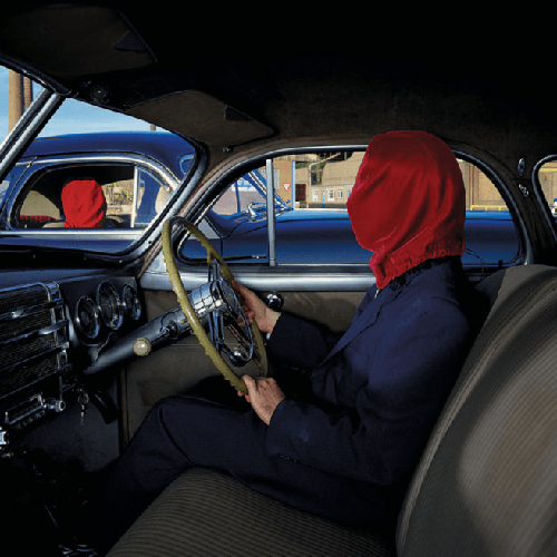
Thorgerson manipulates reality, makes it alienating, reclaims the role of photographic truth, completely distorting it, as rock music had done. It needed the enlightened and privileged gaze of great photographers to narrate its birth, the path to the pinnacle of success and even its end.
 The book:
Raffaella Perna
Grandi Fotografi a 33 giri, Fotografie e copertine di dischi
Postwords n.9
Ed. Postcart, 2012
March 6, 2020


